Saturday, 30 April 2016

Mermaid character costume: Ears


Most of my designs for the mermaid character feature webbed, amphibian looking ears and so before the photoshoot I wanted to see if sculpting out a wearable pair was do-able.

In my initial attempt (first image) I sculpted out the basic shape in wire and tin foil but realised this didn't look as realistic as I wanted it too and had a cartoonish appearance to it instead, so began again.

The next image shows the second try which I made taking into account the aspects of the first attempt I didn't like.  This time the silhouette was different and I put extra hot glue over the top in order to form the 'cartilage' of the webbed ears. Once I was happy with the shape I also glued two hooks onto the backs so they could hang off of the models real ears (third image is me fitting them to real 'ear shape'.)

Finally, when I was happy with them the ears were painted. I made sure to match the colours to the tones I'd be using for the face paints else they'd look bizarre. I also glued a few pearl 'earrings' onto the lobe areas to match the embellishments on the tail and the rest  of the jewelry the character would be wearing.  

Tail Progression: Construction


Now the separate pieces had been coloured the tail was at a stage of completion; all was left to do was sew the two parts together, make any adjustments necessary and embellish it.
The top image shows the simple process of sewing the finished fin piece into the inside of the tail, underneath the bottom row of scales to the join would be hidden. Before this was done a line of sewing was fixed across the tail fin section to stop the wadding from coming out, as can be seen in the previous post.

Once all construction was done, a mixture of PVA and glitter was dotted across the tail in places that would catch the light, or wouldn't look too clumpy next to one another. The excess was shaken off afterwards. Then Charlotte and I sat down and between us glued down shells and sewed on sequins in little clusters in thought out compositions, so again it wouldn't look messy or too busy in one area.

Friday, 29 April 2016

Dying the mermaid tail: Main body

Once the test samples of dyed fabric were dried and colours where compared I was able too decide on which tones would look best running down through the tail.
Opting for the darker greens and turquoises, I figured out the order of the colour range starting at the top at the waist, darkening down towards the feet.

In order to create the gradiented colour effect a 'rig' had to be set up that worked by lifting out sections of fabric from the dye bath and allowing the garment to hang. However the quilted tail fin simply needed to be propped up in a vat with the dye regularly spooned up to ensure a gradual ombre as opposed to a harsh line.

Starting with the lightest colour, sections of the tail were dipped then lifted out of the dye and tied or clamped above it. Gravity would also pull the dye through the piece of costume assisting in the gradient, but spooning colour up regularly was the best method of creating a good ombre.

This process was repeated several times with varying shades of blue and green, ending with the darkest. Before taking it out of the vats and rinsing through with cold water,  I adjusted the rig so either end of the tail got a few minutes of extra concentrated dye to ensure a more vibrant colour.

Wednesday, 27 April 2016

Orpheus: Jacket Fitting. 27/4/2016


As Andy wasn't able to attend this meeting, I used Jordan to fit the jackets I've sourced as according to the Performing Arts students, the character of Orpheus (Jordan) could also potentially be styled in a Ring Leader fashion. Why this is, I'm not entirely sure as the context they passed on to me was a little unclear. However, what I gathered the general idea was is that Hades has the best of everything, so therefore would wear the more intricate and ornamental clothing. On the other hand, Orpheus has the Ring Leader persona, but isn't as polished or wealthy as Hades, so his costume designs would be a lot simpler.
There are obviously a few pieces of missing information here that would be useful to know, so I will try to communicate with the students to get a definite answer.

The jackets that I tried on had a good fit on this actor though. The general consensus was that the military styled jacket in the middle images was a favourite. If this is used then a few repairs will need to be made to it first though. The red tail coat in the top set of images has the most traditional 'Ring Leader' design to it, but it was requested that embellishments could be applied. As the jacket is sourced and doesn't belong to us I'm not sure how much embellishing could be done, and this could potentially detract from Orpheus having a simpler design if ornamentation's are applied over it. This will need to be cleared up and decided in a conversation with the acting students. 

Corset Fittings and Costume Experimentation: 27/4/2016


The visit from the entire cast of Orpheus presented a great opportunity to fit all the corsets that Joy and Magda had previously ordered. It was a perfect time to do this now so that they could be adjusted (if needed) and tagged with each actresses name. This way we could keep track of which corset fitted each performer, making it more efficient in preparation for the night of the production.

Practice for the jumpsuit and corset reveal was also available to be experimented with during this visit: As this is part of a costume change that supports an alteration in environment during the play, it was a good idea to figure out exactly how this would work.

Farnham Meeting: 27/4/2016


During this meeting the Orpheus group from Farnham came down to our studios to visit us. After seeing them in their own environment, it was great to be able to show them how we work and the processes we are currently going through. I think it was very beneficial in showing them what is realistic in the time given for this project, and by giving them an understanding of our methods, we could all get on the same page with the project.

In the meeting it was also decided that Joy and Magda, (the other two designers on the Orpheus project) would concentrate on the girls costumes, as they had focused on the designs for the girls specifically. In my position of providing general research and mood boards, and having already drafted up makeup designs for the male characters, I was formally assigned with the design and sourcing of the boys costumes. I'm more than happy to take this on as it was the designs of Hades and Orpheus that I was looking into anyway.

During the meeting, not only did we display and present our current ideas and progress but we also had the opportunity to watch through a rehearsal of the acting students performing routines from Orpheus. This gave us an insight of how our props and costume will be used, as well as solid examples of personality of the main characters, meaning that deeper characterisation can be explored. I feel that the better the understanding of character, the more developed the world we create around them could be.

Tuesday, 26 April 2016

Makeup Kit: April 2016


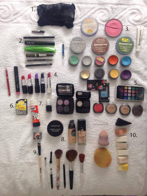
Not including my day to day makeup kit! I'd like to start doing updates of my makeup kits as seeing how it evolves with the experience I gain would be interesting to look back on. This is also the kit used for making every makeup look so far.

1. Wig cap. Used for holding hair back when putting on makeup or tucking hair away when putting n a wig.
2. Eye kit. Includes mascaras, and different kinds of colour and consistencies of eyeliner.
3. Face paint. Snazaroo is the current favourite!
4. Lip kit. Includes lipsticks, pencils and tints.
5. Eyeshadows. Can also be used for contouring, especially when face paint is being worn.
6. Silver beads. Used as fake piercings that can be applied with eyelash glue.
7. Glue stick. Used to stick down eyebrows when covering them up.
8. Foundations of different colours. Variety of colours can also assist in contouring.
9. Brush collection. Foundation, eyeshadow, smudger, and blush brushes.
10. Sponge collection, including a stipple sponge, application sponges and a blending sponge.

Teach Em' A Lesson 2016: Final Piece


Here the full finished production of 'Teach Em A Lesson' can be seen, as uploaded by the Youtube channel UCATelevsion Production. The footage displays the completed professional collaborative product, combining the two UCA courses talents, and it's great to have the opportunity to see it as a  final piece!

Monday, 25 April 2016

Dying the mermaid tail: Samples.

Before any fabric could be dyed, samples and burn tests had to take place first. The burn test allowed us to determine what fabric it is being worked with, which is turned meant we could pick the correct type of dye for the fabric.
The results of the burn tests are as follows:

White fabric: crushable bead, melted, black smoke, bad smell, Fiona reckoned theres probably a bit of nylon in there somewhere.
Green fabric: really flickery flame, same reaction as the white material but had a different, sweeter smell.

Once it was figured out that disperse dying would be required the hot water set up was arranged and samples were made, using a colour palette of blues, greens and yellows. After testing samples of the solo colours, I mixed up some combinations to create in between shades as at this point i decided to attempt an ombre effect through the tail, so use of middle shades would be useful.

The next step in the dying process will be to see the results of the samples and decide on which colour will be used.

Costume Examples: Ring Leader Characters


Through sourcing costumes and working on multiple projects for the C.C.C assignment I've realised that across the different productions there are characters that bear resemblance. For example, in the Farnham Maltings project Hades has been designed as a ring leader type front man. In comparison, we have a lion tamer in the Real Medway and Swale augmented reality project, so using the same costume for multiple uses (as long as the photoshoots or performance dates don't coincide) seems a simple way of cutting project budgets as well as time spent sourcing extra costumes.

Red jackets, top hat, and black trousers with red stripe could be used both for Ellie as the Lion Tamer in the Real Medway and Swale project, as well as Andy performing as Hades in the Farnham UCA production of 'Orpheus.'

Expressions and Characterisations.


While still wearing the makeup, we thought to take the opportunity of playing around with what the makeup can do through expressive face pulling! Also thinking of the characterisation of the narrative, I tried to play the mermaid as grungy and roguish, as thats how the model will be acting in the final photoshoot. The clown too was playing with a range of facial expression. It was fun to see the characters together, and gave me in insight to the personalities too.

Clown Makeup Practise


Using the Cirque Du Soleil mood board as reference whilst figuring out the makeup on my models face, I firstly painted on a white base coat of snazaroo body paint. Making him flex his face and pull a lot of different expressions, I was able to outline faintly the natural creases of his face in light blue pencil. These would act a guide later on when shading in the spaces so only needed to be indistinct as it would be worked over once I began shading. Using blue and purple eyeshadow I shaded in the lines, with a black eyeshadow right at the base of the lines to give a more defined and dramatic contour.
The lips where drawn in with a red lip pencil, then filled in with lipstick. The nose bullseye design was also red lipstick, as I currently don't have red face paint in my personal makeup kit.
Once the makeup was completed we experimented with different expressions to see how the paint moved with the face, which gave results I was really happy with! As a clown, I think it's important to keep the ability to use facial expressions, which I feel was successful in this experiment.

Outfit Progress: Mermaid


Sarah and Emmie compiled this mannequin of the current progress of the mermaid characters outfit, arranging the tail pieces and a top and jewellery they sourced. Putting it all together on the mannequin was a really effective way of seeing what stage the character was at and what kind of steps should be prioritised next. Currently, I feel that the whole things seems a little washed out and definitely in need of colour, so dying and distressing the whole outfit and beginning to consider embellishments will be my next stage with this character.
Thinking of details to add to the punk/ drag queen vibe would be useful to contemplate at this point, e.g. traditional sailor style tattoos, accessories in the hair, where the fish scales will be placed, accessories on the arms etc.

Sunday, 24 April 2016

Tail Progression


With the main body piece of the tail well on its way to being completed, the tail fin was the next step to figure out. Firstly I cut the basic shape from some pattern paper then transferred this to a stretchy green fabric. By making the tail and body sections both out of a stretchy fabric, there was a better match in fabric textures.
Cutting out the fin shape twice, I then cut the same shapes from a length of wadding. The next step was to line up the wadding shapes with the green, then sew these three pieces together. By layering the wadding on top of the two green pieces I could turn the whole thing inside out and the wadding would be encased inside the two green outer pieces. A little hand stitching was required where the sewing machine didn't pick up the sides properly so the wadding was poking through, but this only took a short while to fix.
Once the basic tail was constructed I decided to take advantage of the wadding within the tail and added in some quilted patterns to create a more realistic, webbed/ boned look.

Saturday, 23 April 2016

Mermaid Makeup Practise


Using my own makeup kit at home (photo to follow) I experimented with the drag/ punk mermaid character makeup after being inspired by the research images put together. My main goal was to avoid looking petite, pretty, nymphy or waif-like, and instead create the punk with attitude as discussed with the narrative.

Top 1 and 2: This was the first step of the makeup. First a base coat of white snazaroo body paint was applied to the lower half of the face whilst layers of glue were applied through the eyebrows. Glue should be applied first against the grain, then following it, smoothing it flat. Once dried, these layers of alternating glue and translucent powder were built up, then covered with a layer of mouse foundation. Following this, the white paint was then brought up to cover the entire face, a few coats of this were necessary to get an even coverage. Dark purple, black and red eyeshadows were used to sculpt out the basic contouring seen. These colours were decided through looking at the research mood board posted previously, as blue pinks and greens seemed popular colours in the 'seapunk' sub-culture.

Top 3: Greens, blues and purple shades of eyeshadow were used to contour the rest of the face, then a blue eyeliner to outline the shape of the oversized lips. Shading and blending were big aspects to making this a successful drag look! The same blending applied to the lips, to give an impression of them seeming bigger than they actually are. This was done through using a darker liner, and a lighter colour in the centre of the lips. I gradiated from dark blue and black through to a lilac centre shade.

Top 4: Experimenting with nostril shape. In my designs I've specified having small, slitted nostrils so I drew these in with black face paint and eyeshadow. In this image the nostrils are cutting up vertically. However, I didn't think this effectively followed the natural shape of the nose so in the next image (top 5) I had rubbed off this attempt and drew in nostrils that went out, then up. These looked more natural, and whilst I'm not attempting to create a 'natural' makeup look, I still want the 'mermaid biology' and structure to appear believable.

Bottom row: In the following images the makeup look was complete and the only thing left to do was experiment with hair. Having a big mohawk to resemble a fishes fin would be ideal, but I currently don't have the resources to do that, unfortunately. I sent these images to the rest of the group to critique and I got a very positive response to the makeup that I was really pleased with. There was a general agreement that the final silver and blue wig was a favourite amongst them, so I included two pictures of this one. The two toned hair and sharp block fringe contribute to the edgy punk vibe, in my opinion.

Currently, this look is obviously without prosthetics as I have yet to begin making them . I feel that if the prosthetics don't get finished in time then the look still comes together and works for the character without them, although I will still try to manage my time well enough to get these complete with the team work from the rest of the group.

Tail Fitting 2


After Louise and I cut out the lines of scales I machined them on, starting from the bottom and working up to the top in order to get them to lay correctly. Sewing layers onto the actual body stocking meant that it became less stretchy, so a second fitting was needed in order to check it was still the right size. The above images show that it does indeed still fit fine, and at this point I was also able to observe how the scales looked once on the model, which I was happy with.
 My next steps will be to make the tail fin, then dye and embellish the whole thing.

Mermaid Makeup Revision


Research in consideration of rethinking the mermaid aesthetic. 
As concern over the orange, grey and white colour scheme of the catfish was expressed due to the colours being too dull and potentially not being able to stand out from the realistic background, rethinking this character design has become necessary. The narrative author has described the mermaid characterisation to me as being a jealous, punky and sassy, and wanting to avoid falling into a conventional beauty and fashion category, I decided to look into Drag Queen makeup. I also looked at mermaid inspired makeup, and 'seapunk' inspired designs.
Going on to design and practice these makeup looks will be my next step in development. However, at this point I'd like to stop researching and designing on paper and begin rehearsing and finalising the makeup in time for the photo shoot on Tuesday. 

Tail Fitting 1


Back, side and front views of the first tail fitting.
The seams are on the outside in the photos though, as the fitting had to be done hastily! However, the tail itself fit perfectly allowing me to progress with it. The model did say they have some balance issues which I will keep in mind when designing the tail fin and where abouts the feet will go, as making sure the model is comfortable and not at any risk is priority.

Mermaid tail construction


Knowing the design definitely had the mermaid tail aspect to it, I set about creating a pattern, (left.) Essentially I was making one big body stocking from the waist to the ankles. I decided to choose a stretch fabric in order to stay taught across the model, reassuring me that the tail wouldn't go saggy or need adjusting later. Once this was cut out and a seam was put down each side, I tried it on the model to make sure it fit before doing anything else to it (photos of first fitting to be uploaded.)

After the fitting, strips of the same fabric were cut out in rows of 'scales', ready to be machine sewn around the body stocking. The image on the right displays the bottom row of scales already machine sewn on, and the layer above being pinned into place.

Mermaid Redesign


In discussion with a central narrative writer it was made aware that the characterisation they wanted was for a sassier, punkier mermaid, but they still definitely enjoyed the catfish aspect from the original designs, e.g. barbels and whiskers. Taking this on board, I drafted up some quick sketches of makeup designs not requiring prosthetics. Currently I'm concerned about drifting too far into beauty and fashion styled makeup but through a little bit of further research into drag and punk aesthetics, I plan to redesign and practise this look to make sure that that is avoided.

Scenic Painting: Burial Mound


The burial mound was painted with a range of scenic painting techniques, beginning with base coats of varying greys and whites. Then darker washes were brushed over these, picking out the natural textures created by the Styroputz. Sponges were used to dab on a green moss effect.

Friday, 22 April 2016

Character head designs.


As well as full body costume designs I've decided that the face and head need special attention in order to convey the characterisation I desire. At this point I'm unsure what the personality of the mermaid will be so have drawn them fairly expressionless. All of these looks could be created through use of makeup and prosthetics. In terms of design, I wanted to achieve a thin, wide mouth, and small shaped nostrils as a base. The makeup patterns, ear shapes, face shapes and eye colour choices then vary from each design.

Drawn in photoshop with a mouse.

Concept art: Catfish mermaids.


Final design concepts for the Catfish inspired mermaids.
- Bald heads: I don't think long flowing hair would suit these designs, being bald makes the overall look more streamlined. My logic was 'fish don't have hair; it's useless in an underwater environment so I decided against it.
- Simple tops: A tank top with an under bust corset or simple high necked vest top. Gills or stripes wrapped around the sides of the body. Stick to simple colour scheme of orange, grey, white, red. Could buy tops cheaply to then dye up and distress or appliqué/ sequin.
- Tail sewn with a gradient dyed through it and patches appliquéd up the length. Tail fin a different darker colour.
- Body paint: Pale washed out colours with scales textured on up and down arms.
- Face paint: Differs with design but sticks to same basic colour palette. Sclera contact lenses would be ideal but are quite an expensive accessories for such a small part of the characters design, and can be easily done with photoshop too. Ears can be photoshopped on, but if I have time then making these would be ideal.

Drawn in Photoshop with a mouse.

Catfish concept: Mermaid design


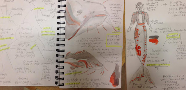
Meeting up with one of the narrative writers for this project I was informed that to go with the idea of 'The Lion Queen', each character could have something catlike incorporated into the designs, e.g. leopard print, ears, tail, patterned fabrics. To integrate this concept into the mermaid character, the idea of basing her on a catfish came to mind, which would also go with the unconventional mermaid idea it is I'm working on.
Left to right: A mind map brainstorming ideas for a catfish based character. Colour schemes, facial features, hair, and environment were discussed here. Drawings were then carried out in order to observe shapes of the animal and colour schemes. I then drafted up an initial catfish idea using these ideas and inspirations, keeping in mind this had to be turned into a costume later so fabric choices and production techniques were beginning to be taken into consideration.

Costume research: Female Inmate 1950s.


Specifically researching into female prison uniforms of the 1950's, the typical striped jumpsuits I expected to arrive as a result were instead replaced with images of these simple dresses. It's seems that the stupid jumpsuits were usually used for male inmates, so would not be appropriate for the women in 'Orpheus' to wear. These scrub-like pinafores would be relatively simple to make and easy to adjust so only one or two patterns would be needed to potentially fit the entire female cast.

Looking through the timeline I put together, the 1900's showed long conservative skirts, aprons, long sleeve shirts with arrow print over them and a white cap. The uniforms are obviously unprovocative in design, and this was decades before women wearing trousers was a socially acceptable fashion too.
The early 50's brought a much high hem line, half way between the knee and the ankle. Short sleeves were also featured, and covering the hair was no longer seen as a necessity.
1970's brought an even shorter hemline above the knee, and again the pattern for these types of dresses would be relatively simple to draft and make. However, I'm not sure at this point if there is enough time to create these, as simple as they may be. Sourcing these or finding outfits that instead of being historically accurate symbolise the prison scene it is we're creating may be better ideas that I will pitch to our design and making teams.

Initial Mermaid Designs: Sketchbook.


Being given the mermaid character to research and draft as part of the design team in this project, I went straight to my sketchbook to doodle up some fashion inspired designs. I started with a basic human figure (top left), drawing out leotards and dresses, (the sketchbook containing the rest of the designs and development will be submitted with the rest of this project.) This led me into figuring out an original design for a wearable mermaid tail, as well as variations on the aesthetic and colour scheme.
Doodling out a range of tops, tails and makeup definitely allowed me to get a handle on designing the mermaid creature, but through this development I realised I didn't want a character conventionally beautiful, and definitely wanted to avoid Disney's 'Little Mermaid' type looks. Because of these decisions, I began looking into different body types and alternative fashions.


From left to right:
1) Average body type. Hips in proportion to shoulders, natural curves.
2) Athletic build. Realistic for a mermaid whose swimming everywhere, squarer shapes, muscular.
3) Curvier body shape. Rounder shapes and curved lines, rounder face shape too.
4) Pear shaped body type. Hips larger than shoulders, unconventional, mix of previous three.

I currently have no preference in body type, as I'd like to further my designs before deciding on this aspect of the character. It will be helpful when looking for a model though and the consideration will assist in my unorthodox mermaid design.

Thursday, 21 April 2016

Concept art: Clown twins.


Final design concept for 'The Conjollie Brothers': Conjoined clown twins.
- A creepy vibe to them expressed through dramatic contoured makeup and pale faces.
- More neutral colours are displayed here to go with the old fashioned freak show vibe.
- The two heads could be achieved through Photoshop and duplicating the models head.
- Bowler hats express a nod to 'Laurel and Hardy', a comedic duo who famously wore this style hat.
- In retrospect, adding ruffs, collars or bow ties around the neck could have been beneficial in design. This way cutting out and replicating the heads in Photoshop may be easier, as there will be no neck to line up or make look anatomically correct. I think that this will be something that is later incorporated into further designs and concepts for the character, as it will probably be a worth while addition in both aesthetic and editing.

Orpheus: makeup design experimentation


To go with the Hades make up test I also experimented with potential designs for the character Orpheus.

Inspired by the traditional Greek history of the play, I designed this makeup to resemble a mask, symbolic of the kind of masks performers would wear on stage. The top row of images show a simple black and white palette, whereas the bottom row displays an under-eye tint of red to tie in with the burlesque and cabaret theme.

The gradient effect was inspired by the previously put together influence map. The darkest line cuts across the forehead, but the shaded aspects are quite subtle over the actual facial features, so I feel that this design wouldn't detract from the actors expressions.

Again, I'm not sure if this look is muted enough to combine well with the prison scene? It could match the burlesque club environment but less so the prison, which is the same situation as the Hades design right now.

Hades: Makeup design experimentation


Inspired by the mood board of costume and makeup designs I put together for Hades I decided to experiment with some makeup looks of my own. I really liked the dramatic shading and contouring, as well as the slightly gothic aesthetic that was evident in a few of the images.
One of the first things I noticed throughout the mood board was the sharp, thin and sculpted features created with makeup, and so used a gradient contour to form theatrical cheekbones and features. Evil characters are also often designed with long, sharp, pointed features assisting with their villainous characterisations.
I also had in mind that this would be performed on stage, so the makeup had to be a little heavier than normal so all audience eye lines would pick it up. I also chose a black and white palette to experiment with, as it makes the whole look more dramatic.

The characterisation of Hades that the performing arts students seem to be looking for is something I can see in Moulin Rouge's, Harold Zidler (as pictured in the previous post). A powerful, charismatic man who plays the rest of the cast like puppets. It is when the students requested a red tail coat and top hat for Hades that this resemblance came to mind, so making a younger and perhaps little more wicked looking version of this character could be what they're looking for.

I kept in mind that all characters will be performed in two different environments; the burlesque club named 'The Underworld', and the prison, so the makeup would have to suit both of these locations. Because of this I toned it down from the images on the mood board, but am still not sure if it will suit the prison scene. Maybe creating a more subtle look using natural tones rather than black and white could be the answer to this?

Currently I'm unsure whether the students require makeup or makeup designs from us yet, but I feel  it's better to design them and have them ready to be critiqued than not, and took the opportunity to practice while I had an available model!


Clown Makeup Inspiration: Cirque Du Soleil.


The makeup for the clown will be a very important aspect of its characterisation. Wanting to steer away from a classic 'entertainer at a kids party' look, I looked to Cirque Du Soleil for my inspiration of this makeup. Bearing in mind this will need to be done on a model on the morning of the final Photoshoot, I'd like to keep it fairly uncomplicated as being a part of the makeup team means this won't be the only makeup I'm applying.
Cirque Du Soleil use a lot of gradient and ombre effects in the style of clown makeup I've specifically been inspired by. Using quite elegant shapes that assist in contouring the face, the make up though beautiful is still definitely that of a clowns which is the aesthetic I'd like to produce.
Blue, white, red and black are dominant colours in the palette of tones used for the looks featured. The shapes and shading created within the makeup also frame the faces creating a variety of potential effects, e.g bringing out cheek bones, making the eyebrows look longer and thinner, or enhancing laugh lines and wrinkles for comedic effect.
Along with the inspirational images above I've included some initial makeup looks to experiment with or develop. One or two I copied directly in order to get a feel for the kind of makeup/ shapes.

Costume Sourcing


For a project that has its deadline commencing relatively soon, we decided to try and source as much of the costume and props that we could. Obviously making and sewing is what we'd ideally like to be doing as that is our area of study, but the priority is meeting the deadline that the employer has set. By sourcing costumes we're saving a lot of time otherwise spent sewing from scratch things we could source much easier.
Making use of a selection of the costumes left over from a family theatre company I was able to travel to the storage space where these are kept with Leigh and pick out costumes relevant to the project.
On the left, Ellie is trying on trousers that could potentially be used for the Lion Tamer character.
On the right is one of two of the racks of costumes displaying the assortment of costumes.
Obviously some of the costume wont be able to be sourced, such as the mermaid tail, due to the rarity of owning such specific costume items. This will have to be made instead.

Wednesday, 20 April 2016

Hades Burlesque Character Board


Potential ideas:
- Both versions of Hades could have the same makeup to carry the character across scenes?
- Makeup could be toned down so it matches both burlesque and prison scenes. This means there wont have to makeup changes between scenes too?
- Painted on masks type make up, with a gradient fading down the face possibly. Goes with the burlesque, ring leader, front man characterisation.
- Boyish, defined contouring to create an 'evil' pointed, sharp looking character.
- Military styled red jacket, or red tail coat and a top hat.
- Black, red, gold, colour scheme to go with the burlesque Underworld club.
- Dramatic contoured makeup.

Initial Clown Designs: Sketchbook


Having the two headed clown character to design meant there was a lot to be experimented with. In my initial designs not only was I attempting to create a character and visual for that personality, but I also began to figure out how to go about making a two headed person suit. The first ideas included a very large shirt and pair of trousers developing through to ideas of a three legged, two headed character and using two models with a 'three legged race' type positioning.
The designs on the lower half of the images have more technical methods behind them with the bowler hat twins created through duplicating a singular models head. The black and white jester has two faces that are in a constant state of being warped, like they're fused together at the centre. This could be done through prosthetics or with Photoshop editing.

The Whiteboard: Group References.


The whiteboard in our base room was a really, really effective way of keeping everyone up to date and aware of the tasks they'd been assigned and what was left to be done. It meant than any updates could be posted and people would be notified really quickly. It was easy to refer to who was modelling what, and who was concentrating on what character so potential confusion was avoided this way.
It should be made clear that not one person should be 'in charge' or possessive over one character, as as a collaborative project all designs should be open to criticisms.  However, it was easier to assign the completion and base design work to separate people in order to have a singular decisive individual for each character and ensure completion for the deadline.

The whiteboard image displays who was responsible for what and the different teams we assembled.

Monday, 18 April 2016

Sketchup Screen-shots.


These 3D designs were created using Sketchup and the dimensions given through the diagram below:
I then downloaded and altered the patterns of 3D model furniture to place within the space I created. This was a really good way of experimenting with space and objects to see what kind of layout could work best. Currently these designs are made from what the Performing Arts students have requested (or a basic version of it, as I'm not experienced in the software.) I included a birds eye view and first person perspectives so the scene can been looked at from a variety of angles. 
The scene I concentrated on was where Eurydice is drugged by Hades and is telling her story from standing on a podium, surrounded by the other burlesque dancers walking around her. The podium is situated between the audiences own club tables to add an immersive feature. 


Sunday, 17 April 2016

Burlesque research and history, 1970's - Modern.


Around the 70's burleque as a historic and original art form began dying out, as as early as the 1930's there was a social crackdown from the public, claiming burlesque to be obscene and distasteful, gradually leading to its downfall. Revived during the late 90's by indpependant entertainers wishing to bring the glamour and beauty back to burlesque, the foundations of what is now known as 'neo-burlesque' could be seen, bringing us to the style we see in modern day. Dita Von Teese is a famous name in this style, a lot of her looks inspired from 40's burlesque, but obviously with the corsetry and hints of modern day stylings.

1970s: Contemporary American cabaret, Liza Minnelli is a big name in this era, arty, stylised, nods to earlier decades, YMCA as an examples of 70's cabaret.
1980s and 1990s: Burlesque and cabaret really seemed to really die out during this time, with not a lot of examples I could find or read up on, showing that the decline in burlesque was predominantly around this time.
Early 90'-2000's: Neo burlesque revival, brighter colours, corsets, influences from previous eras, diffrerent varities of style, e.g. pastel, gothic, punk, rave, abstract, couture etc.

Burlesque research and history, 1920's - 1960's.


As the interpretation of 'Orpheus' that we're working on has a burlesque theme running through it, I decided to look through the history of this fashion, as the current era is undecided. The decade of choice is important to our transposal of 'Orpheus' as it will affect the decisions of both set and costume. Currently, the Performing Art's students refer to the era they want as 50's burlesque, however this may not apply to the fashion they really have in mind, hence the research into the separate decades. The examples they brought in consisted more of modern day lingerie than recognisably burlesque or traditional cabaret styled outfits, so putting this time-line together and giving them the option to pick out which style and era they prefer would be beneficial.

1920s: Big fans, intricate jewelry, play on an innocent look, feathers, head-dresses, feather bowers.
1930s: Androgynous, stockings, floaty unfitted clothing, use of props.
1940s: Long flowing robes and night wear, elegance, femininity, more fitted than previous.
1950s: Corsets properly introduced into art of burlesque, fitted, suspenders.
1960s: Corsets, robes, playboy bunnies debuted adding to the skimpier, tighter corseted look.

Eurydice Cage Concepts


After researching visuals of cage fashion, I doodled up some concepts of my own. I used a simple silhouetted style to draw in for now, as the costume will probably be minimal in detail itself to support the time frame and budget for the project.

The performance requires the other characters who are dancers in the scene to walk with chains or ropes around Eurydice supporting the imprisoned theme, so this choreographed choice has been relayed into the designs.

1. This design displays a simple caged skirt that could be made from boning, fabrics or ribbon. The chains would be attached to a loose neck piece. The chains for now were just drawn as thick lines to make their positioning clear for simple doodles.

2. The cage aspects for this concept are are a half head and shoulder pieces. The half cage frames the head creating a halo, possibly representing the innocent and pure nature of the character. The shoulder pieces are to reinforce the caged theme, and the chains would be attached to the wrists instead of the neck; I'm concerned about putting anything around the neck of an actor for obvious health and safety reasons. However, wrist placement may mean the Eurydice has to turn with the dancers pulling on the chains, instead of being able to independently move.

3.  This design was more to experiment with a full head placement of the cage, as inspired by Alexander McQueen, as well as safer and easier positioning of the piece that is connected to the chains: A belt with connections to be clipped into seems safe and easier in terms of choreography, as the belt would move independently of the stationary actor so they may remain facing the audience and there's no risk of a choking hazard.

4. So far this is my favourite design as I think that having the head fully encased by the cage is the most effective way of conveying the theme of imprisonment, as opposed to a caged skirt or shoulder pieces where they may be a danger of it looking too 'fashiony'. The body harness would be stiff and used as the connection for the chains, maybe created out of a thermoplastic like Worbla and foam, as I think boning and fabric would be too weak or thin. The hands are also tied in front of the actor here to further the trapped topic, but with pearls instead of shackles as suggested by Joy in the meeting with the Performing Arts students.

Eurydice Influence Map

During our visit we discussed potential costume and set themes as well as motifs to continue through both 'Orpheus' and the other plays.
The initial idea presented by the Performing Arts students was to design and make a tall thin cage on wheels that would hold the character of Eurydice, representing a subject of entrapment. However, this would introduce the difficulty of transporting and building large pieces of set in the short amount of time it is we have, as well as potentially using majority of the budget on one piece.

Instead, the idea of taking inspiration from Alexander McQueen's caged fashion was suggested and rather than creating a cage for the character of Eurydice to stand in, she could become the cage herself. As the rest of the production uses hints of costume and set to suggest themes and environments, this metaphoric costume idea would fit in with the rest of the symbolic aesthetic we're working with.


Influence map for Eurydice cage costume concept:
The left column displays Alexander McQueens regal head cage piece. I like how even though this head piece is obscuring the models face, the cage itself is beautiful and delicate looking. This feminine or intricate look could inspire designs for the costume of Eurydice.

The middle column shows several example of modern cage fashion, moving from just the head to the rest of the body. These look less couture but definitely simpler to make. I'm particularly drawn to the copper looking leg pieces, as they almost resemble a rib cage; having skeletal themed costume could also be symbolic of the Underworld and themes of death in the original Greek myth.

The right column shows a useful process of making example and a structured LED body cage, which could potentially tie in with both the burlesque theme and the sleezy 'Underworld' night club theme too.

Saturday, 16 April 2016

Icarus and Orpheus lighting experimentation


The groups that played with lighting during our visit were 'Orpheus' and 'Icarus'.

The 'Orpheus' interpretation takes place in a divided world of both a burlesque club and a prison, what era is still to be decided. The original idea was to have prison bars as pieces of built set, but through light experimentation and cutting out cardboard to form 'stripes' we were able to create bars more effectively, (right hand image). This was so the 'bars' can also be removed from the stage with the flick of a switch, and for a production that alternates between worlds frequently and quickly, this is a more efficient option.

The 'Icarus' performance consisted of two partitions creating three walled spaces. Each 'room' had its own backlit colour to provide a different mood.
From right to left: Red lighting to provide a romantic mood for a jazz club scene. White light for the center setting of a chefs kitchen, with a very hectic and cluttered feel, (top image). Finally yellow lighting for an outside smoking alley, where the mood is chaotic, (bottom image).
This worked very effectively as it drew the audiences eye where it was required whilst setting the moods successfully. The partitions, whilst minimal and a simple way of dividing spaces also worked really well teamed with the lighting, as entirely different rooms where represented and created.

Antigone, Projection experimentation.


Further photos of the 'Antigone' group investigation of projection lighting.
Blank grey t-shirts allowed the projections to show up clear, as well as hold the colours better than darker colours would have done when using gels in the lighting. The moving projection images suggested surreal dream-scape themes and only required simple costume too, so a project of this motive would be easy to source costume or blank, minimalistic set for.
The mood can be changed through the colour of lighting or through the projected images themselves, possibly varying from light hearted colourful graphics to harder hitting scenes from the news.

Final Lighting tests: Dress Rehearsal


Photos taken after the final set up of both flats and props.
About half an hour was taken to set up lighting and cameras to the point where filming could begin. Being able to watch the set and props in use, both with TV crew running about before filming and actors in character pacing across the set was really rewarding! The blue and red lighting brought the set to life and gave the impression of three different sections of stage, supported by the three angled walls themselves.
Seeing the TV Production students carry out their part in the project now ours was finished was also really interesting, and we were able to see both teams work combine to create a really cool finished product that was fun and satisfying to watch.

Lighting and Projection camera experiments.


The afternoon of the visit to Farnham was spent experimenting with the students, their current concepts and forms of lighting. Above can be seen two students with blank t-shirts on working with projection, an idea that the 'Antigone' group have in mind. By setting up a camera, we are also able to see what this would look like on screen or filmed or to a larger audience.

The lights had different gels over them so experimentation with coloured mood lighting could also take place, something that the 'Icarus' group decided to work with (demonstrative pictures to follow).

Overall the use of lighting and projection could potentially save us having to make multiple sets that would be outside of the budget and difficult to later transport, but mainly could look more effective than large pieces of set. Lighting is also a more efficient choice of changing environment and mood than pushing set on and off, so it would be good to see if this method could be applied as it seems beneficial in terms of budget, time and potential aesthetic of the performances too.

Friday, 15 April 2016

Little Bulb: Contextual Background


Little Bulb are a theatre company that describe themselves as being "A group of friends who are passionate about making theatre together." First establishing themselves in Kent, 2008, Little Bulb now hold several awards including Fringe First at the Edinburgh Fringe Festival, and tour both at home and abroad.

Above is an image of Little Bulb's interpretation of 'Orpheus' which I found to be appropriate as that is the production I'll be working on with the performance students. It's definitely interesting to see their own transposal of a play they're helping students re-create.

Little Bulb are currently working with the UCA Acting and Performance students at Farnham by assisting them in devising gradually more extensive performance pieces giving feedback and advice weekly. Firstly they began with a 3 minute piece exploring an initial idea, followed up the next week by an entirely new 7 minute concept. The week after that they were then made to choose one of these ideas and convert it into a 15 minute performance. After that came a 30 minute exploration and development of the idea, with critiques afterwards. Our role as designers and practitioners is to take these concepts the students arrive at and design to them, bringing the characters and environments to life.

Their website: http://www.littlebulbtheatre.com/

 Administrative Director: Clare Beresford
Artistic Director: Alex Scott
Musical Director: Dominic Conway

All of these peoples contact details can be found on the Little Bulb website.

Reconsidering stage space: Orpheus.


Now knowing which play I'll be focussing on for this theatre festival, myself and a few of the acting and other design students re-visited Farnham Maltings to look over the potential theatre spaces again. Taking panoramic photos allowed me to look at the rooms as a whole after leaving, as opposed to lots of little images. This also lets me see the composition of the room a lot better than serparate images would do.

1) Top image: This room was agreed to being too open and light for a burlesque club scene. There where also no rigs for lighting up, which would mean additional rigging for an entire room. However, use of a mirror would make the room appear more crowded and may be very useful if the audience are to be immersed in this?

2) Middle image: So far this is our first choice for the Orpheus production to take place. The layout of the room is suitable for the potential staging plans that the Performing Arts students had in mind, it isn't too bright, and it already has rigs in place. From spending time talking about lighting with the students, it's clear that lighting, specifically at least five spot lights will be needed, so this is also ideal for that aspect of the production. The depth and dimensions of the room are also suitable, as I think that a gigantic space would feel too impersonal for the immersive club experience they wish to create. This space is also suitable for the seating they've chosen to use.

3) Bottom image: The Great Hall was the biggest space of the three, with prebuilt seating and stage area. It was very dark in here when I took the photo, which is why the quality of the image is so low and had to be edited! There was mention of potentially lowering set down onto the stage, which would be difficult in this environment as the ceiling is so high. However, with a possible flight deck/ flying plan, this could be possible; that is something I will need to enquire into. Again, it is harder to make this space personal as it's so large and open, but perhaps with the corridor leading into it dressed as well as use of the walk way the students can be seen standing on in the image, this could be achieved?

Overall, either the environments in the middle or bottom images could work with 'Orpheus' but ideas will be discussed with both the Performing Arts students and the rest of the design team.