Tuesday 29 November 2016

Mask Prototyping.


Having designed a mask to tie into the narrative of the Hoopoe character, I've begun to prototype and draft up patterns for this piece of prop costume. Going with the plague doctor design, I first plan to prototype until I get the right size, fit and shape that I'd like to achieve.
Firstly, I took my pattern and cut it out to size. I then used two pieces of A4 craft foam as a base material to experiment with, as it is sturdy enough to stand up and hold a shape but soft enough to mould, move and be able to stick into place.
I pinned the pattern to the craft foam so it wouldnt move around, and used it as a stencil. I then cut the pieces out, but had to experiment a little with the best method of sticking them together. This ended up being with pins to hold the pieces in place. then PVA glue left over night to dry.

Main Character Final Design: Yool costume sheet


'Yool' Shortened from 'Euelpides'.
His best friend since childhood is Ty. Although Ty is more dominant and confident than Yool, he never envies him of this, he instead has a a lot of pride and faith in his companion. He knows him well enough to know when he's going to lay down one of his famous speeches, and often beams or remains quietly smiling in awe of his friends skills in speech. Although quieter, Yool is no pushover and has the same steely determination as Ty, making them an ambitious and formidable team. Yool is more sensitive to other people than Ty is, often thinking quite rationally and logically and considering how others may feel. Because of this he's usually the first to check if someone is okay. Compared to Ty, Yool is quite level headed, Ty being the one who often gets carried away with passionate speeches and grand plans; sometimes he has to bring him back down to earth.

I chose pastel blues and lilacs to match Yools sweet and gentle nature. This way his design contrasts to Ty's, as one part of my design plans for them was making sure they were obviously different from one another, as the original script doesn't define the two too differently. In fact, the character of Euelpides ends up drifting into the background and not being mentioned a lot towards the end of the initial script. I wanted to avoid these kind of plot holes and have a consistent story rather than conveniently have characters disappear half way through the production.

Similar to the long coat I chose for Ty, Yool wears a large poncho to add to his 'cute' vibes and a neck scarf to hide the maquettes neck joint. I've also drawn him with his bird cage and spotted carry-sack from the opening scene of the film. Both main characters wear simple boots that would be designed to withstand long distance walking. Yool also wears gloves to protection against the elements, whereas Ty has very long sleeves and heavy cuffs.

Sunday 27 November 2016

Main Character Final Design: Ty costume sheet


'Ty' Shortened from 'Pisthetairus'.
His closest relationship is with Yool, his childhood best friend; they were companions when they lived in Athens together and both decided to leave in search of a life of freedom, devoid of responsibility. Together they plan everything, but Ty is usually the spokesman and the leader of the duo.

In contrast to Yool's design, I chose khaki's and more earthy tones to suit Ty's calm, collected and more mature personality. Earth is also the star sign most linked to determination and ambition within the Zodiac signs, linking to Ancient Greek beliefs that Astronomy was the first science. However, I made sure that the colour scheme still matched the pastel aesthetic that I've used to design throughout this project.
Overall, Ty is extremely smart and charismatic, but uses these traits in order to manipulate people sometimes. He is very quick witted and thinks on his feet, which often gets himself and Yool out of sticky situations, and has avoided many a confrontation because of these skills. His downfall is the fact that he perhaps begins to take advantage of people and not even realise it, sometimes putting strains on his and Yools relationship.

The choice of shape and costume came about quite naturally. In cartoons, the main characters are often the most simple in design as these will be the figures drawn the most frequently, therefore should not be over complicated or difficult to redraw and intricately model with every new frame. I went for a cute beret with a bird feather in the band for Ty, as I thought a slightly military styled outfit would suit his strategic and precise mind. The feather also relates to the anthropomorphic and animal themes of the film. Having a long coat also helps in the production of the stop motion puppet as it would mask a lot of the figure, meaning a smaller overall project concentrated on one character.
A high necked coat was decided specifically, as within stop motion puppetry it's a lot easier to conceal maquette than it is to try and making a complex, working neck joint. For this reason I've covered the necks on both my characters.

I chose to draw this costume and expression sheet out in a digital format as I felt that the aesthetic and character design suited that media better than paints and pencil. However, for the darker more twisted character of Epops that holds a lot of character within the sketched out marks themselves I'll be hand drawing the designs.

Thursday 24 November 2016

Caricature Doodles

After researching caricatures and focusing on Donald Trump as a hint of real world influence, I doodled out some expressions and styles for the Hoopoe: One more realistic with his beak wide open in an interrupting and baffled shout, the other simplistic line art of the whole figure. These were fun and quick to do, and let me explore the character a little further through this expressionistic art form.

Caricatures and Real World Inspiration.


Developing the narrative for the Hoopoe and his characteristics further, I likened him to a 'certain political figure' after understanding his power hungry attitude. Looking into caricatures helps to understand that central features of someones face which are always heavily exaggerated depending on their personality. For example, here it's often Trumps hair and mouth; his hair being a signature feature that is often poked fun at, and his mouth represents him being an outspoken and loud individual. These kind of traits could be transferable to my own characters, and is a design idea to keep in mind when creating extremes or characters that represent someone or something.

The Hoopoe himself I've written to be quite contradictory in both himself and hopefully how the viewer sees him; I'd like to showcase him as being greedy and selfish and have the viewers become frustrated and shocked at him turning on Yool and Ty after initially befriending them. On the other hand, he's a downtrodden mess that (rightfully) lost his power and human status, so even though he's a horrible creature, you can't help but feel sorry for him too. He's a character easy to make fun of, and although very headstrong and ambitious in his hunt for power, he's still extremely sensitive to comments on his dwindling appearance.

Character Concepts: Sketchbook

After a tutorial of looking through all the work I had so far, both myself and the tutor agreed that although I enjoy creating digital work, I should branch out and create a few of my final pieces using traditional media. The pencil sketches and watercolor had a lot more life and character to them, and the digital painting was making the design look too flat and lifeless.
Because of this, I've decided to draw the final three designs depicting the Hoopoe at the beginning, middle and end of the play by hand. This could be pencil, but I may also experiment with charcoal or paints too! However, if there's a character or scene that I feel would suit digital work better then I will still use Photoshop to complete this.
Below are a few photos I took from my sketchbook, showing a few of my favourite hand drawn drawn concepts, as well some designs for the characters of Euelpides and Pisthetairus; names now shortened to Yool and Ty, to make them easier to remember and pronounce. 


The Hoopoe: Beginning of the film

Developed mask designs for the Hoopoe. He uses this is keep himself from physically falling apart in an attempt to maintain dignity. It eventually does the opposite and just makes him appear more pathetic. 

Beginning and Middle sketches for the Hoopoe.

Developed designs for 'Yool' and 'Ty'. I considered what they may look like before and after eating the root and growing wings. 

Tuesday 22 November 2016

Jan Svankmajer: Artist Inspiration.

Czechchoslovak animator extraordinaire, Jan Svankmajer's bizarre films are something he's been creating since the mid-60's. His style and medium of animation usually consist of stop motion, 3D, live action and puppets, but can also often be an eclectic mixture of them all.
The stories he tell can be seen as creepy, eerie or surreal, but I love how a dark imagination and sense of humor can be shown through this medium; using children's toys, or seemingly innocent figures and objects. His animation are nothing short of twisted, each one of them having a distinct macabre vibe to it and an extremely defined aesthetic.
Below I've embedded two of the videos that I feel best represent the particular sense of humor; childish through visual means, but slightly grotesque, definitely showcasing more adult themes. 


'Alice' Seems to be an interpretation of the famous scene from 'Alice in Wonderland' by Lewis Carroll, where the character of Alice drinks from a bottled labelled 'Drink Me.' Upon doing this, she suddenly shoots up and becomes as large as the room she's standing in. 'Alice in Wonderland' already has quite surreal and potentially more mature themes, that have been previously interpreted to be centered around hallucinogenic drug use. The use of a childs doll and a scale set add to the creepy mood, as well as the use of audio; only sound effects and no music.  


'Flora' is a very short animated piece that experiments with themes of decay. This could be interpreted as to having themes on motifs of life and death, starvation, abandonment.
It's been really interesting to find an animator that experiments with the same humor that I've been looking into, as well as makes such innovative and creative designs in how to use stop motion.

EDIT: Unfortunately, during this project some of the videos were taken off of Youtube!

Thursday 17 November 2016

Final Character Designs: Concept Turnaround


This is my final design for the minor character of 'Prometheus'; Zeus nemesis, and the character that gives the two men a hint on how to beat the king of Gods.
Sly and cunning, I based his design off a quote from the original text "A fox is subtlety itself", tying my theme of anthropomorphism into the design too. I wanted it to look like Prometheus had thrown on a mask and cloak as his disguise for patrolling the city in search of Euelpides and Pisthetairus, steering clear of Zeus' watch from the heavens. Because I wanted it to be obvious that it was a disguise and not an actual animal, I designed a large lumpy hunchback, a mask with boldly contrasting colours so it wouldn't look like it's connected to the rest of the character, and used a silhouette of a person hiding beneath a blanket as inspiration to create his shape.

His cloak will be made from a collection of foraged materials that the character would be able to create or collect himself; leaves, hair, feathers, twigs. How I would want it to appear is a moving, rustling, life of its own, maybe even squirming or morphing slightly, in order to hint Prometheus' immortal powers as a God. (Below the turn around mage I created  a small sheet of certain textures that could be used for the cloak, or that the cloak texture and pattern could shift between.)

Even as a minor character, I wanted to put as much effort and development into Prometheus as I would do a main character, as I feel that the personality and justifications to the design will be better fleshed out this way. By undertaking the full character design process, I was also able to learn more about my environment, and also consider more deeply the making aspects of this assignment. At first, I wanted to create an immovable concept model of this character, about 4 inches tall, as a display model for showcasing the film it would be in. However, through developing these ideas I realised that in retrospect, that idea is quite boring and not really furthering skills or narrative any further. This way I was able to come to much more in depth or challenging ideas.
Overall though, I'm pleased with my design, and think it could be interesting as some kind of large costume piece, rather than a small model!

Wednesday 16 November 2016

Confirmed Project Concepts.

At this point in 'The Greeks' project, I've arrived at a few points that I'd like to start developing fully in terms of making. Up to now I've had a few different ideas of the kind of things I'd like to make, e.g. the cast model of the Prometheus character, or a model of the city. However, I've arrived at several making projects that suit my areas of interests a lot better, as well as the experimental nature of this assignment.


OWL MAQUETTE/ MODEL.
- Sculpted and cast box of interchangeable faces. 
- Presents opportunity for experimentation with painting techniques. 
- Experimenting with sculpting and casting processes. 
- Could possibly make a small bust. head and shoulders, with which to display and change them on? With feathers or fabric? 
- Currently contemplating whether to make the whole doll or not. 
- Maybe just explain how I would make the whole doll if I were commissioned/ to a pro standard?
- Make the box, (or get assistance in making this) to display the faces in? Like a 3x3 or 3x2 grid? Decorate with moss and mushrooms.
- Decide on the number of faces, which expressions and also how big this is gonna be. 

SOFT BIRD SCULPTURE.
- 1:1 scale, soft fabric sculpture.
- Floppy, to imitate a real bird, but with a simple wire armature running through it, so it becomes pose-able and gives it a basic skeleton. 
- Sculpted masks instead of faces: The mask styles harness these birds wear when they're flying to keep the city afloat. 
- Use simple or recycled fabrics. Need to consider a pattern and method. What texture should these be?
- Methods of sculpting out the masks and what to cast them in. Different paint jobs, experimenting with weathering and different kinds of paint. Should also consider how to attach the masks to the bodies? (Screw them in from the fabric behind? Magnets?)

PLAGUE DOCTOR MASK. 
- Pattern and fittings.
- Find a model.
- What material would be suitable to use? Vegetable tanned leather? (Mouldable and easily used.)
- Will the material need specialised sewing techniques?
- Prototypes with foam sheets/ paper/ sizing/ pattern and figuring out how it goes together.
- How does it represent the Hoopoe? Story behind it and how to tell that visually.
- Detailing like weathering, feathers, colouring anything metal? Ornaments? Embossing? Any images engraved or pressed into it? Eye holes?
- Make final mask designs. 

Tuesday 15 November 2016

Owl Character Progression.


Wanting to progress my characters so I can begin finalising the designs, I concentrated on creating a small expression sheet for the Owl character I've been working on. Here I focused mainly on experimentation of potential facial features as well as body shape and posture. I've yet to figure out the exact fashion for the Owl, but as the facial expression and features are what I'd like to take forward into a minor sculpting project, this is what I've been making sure to concentrate on. I will of course figure out the Owls personality and role in the bird city as a whole, as I'd like for my designs to have backstory, justification and a sense of three dimensional depth to their characterisations.

I chose three expressions to work on in Photoshop that, between them, showed the most diversity; neutral, shocked and annoyed. I also chose a full body sketch to show the kind of proportions I'm looking at, at the moment.
My next steps from this will be finalising the design, confirming the personality and characterisation, then sketching out a final expression sheet in order to begin sculpting. I think this order is quite important, as I want to have the personality and characterisation fleshed out before I start thinking how this character would expression emotion.

Rhino Continued: Polar Array and Notes.

Another type of Array that can be used is 'Polar Array'; replicas that create small circle. It would be easy to make these orbit something, as the angle and placement is up to you too.

Notes and tips from the class are as follows:

1) Double click a viewpoint title, e.g. 'Perspective' or 'Front' to full screen that viewpoint specifically.

2) When in 'Perspective', Shift+Drag to pan.

3) When placing a new object, type 0,0 in the command bar after it's text command.

4) Holding Shift when placing a line will snap it to horizontal or vertical axis.

5) The command bar will tell you what to do next, e.g. Press enter to confirm etc.

6) The Copy Command: Copies and pastes the same shape infinite times/ as many times as you click.

7) You can use spacebar or right click as well as the enter button to confirm an action.

8) Dragging from right to left creates a 'crossing window' and it selects anything it touches.

9) Dragging from left to right is a selection window and it only selects things it covers completely.

10) Ctrl+A = Select All.

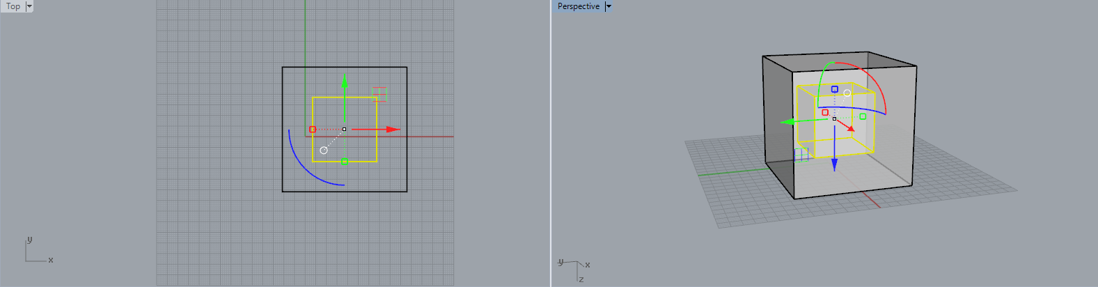
11) Gumball mode: Move, scale and rotate around the axis points, highlighted in green, red, and blue.

12) Pink lined shapes: This means that this form is only a preview, showing you what it might look like without fully rendering it.

13) Shell tool: Selects a face to remove.

14) Extrude Planar Curve: Turns 2D face into a solid 3D shape.

15) Boolean Union: Merges two shapes together to create one.

16) Boolean Difference: Trims shapes that are overlapping one another.

17) Split: Splits up overlapping shapes into separate pieces.

18) Join: Connects two shapes to form a single object.

19) The phrase 'watertight' refers to a modeled object that has no holes, no gaps, and is in an acceptable state to be 3D printed. When checking whether a shape is watertight or not, type 'What' into the command bar, then check for the phrases 'valid polysurface' and 'closed polysurface' to know it's suitable to be printed.

20) Explode: Breaks full objects down into separate components.

21) If you go Solid > Cap Planar Holes, these actions will cap an item and make it complete/ it fills any holes that may be there.

Rhino Continued: Boolean Union, Mirror and Arrays.

(Blogger sometimes doesn't like it if you post too many images into one published post, so I've split the Rhino lesson up into several blog posts instead.)

Using the 'Tube' tool (a right click option from the 'Box'/'Solid Creation' button), I created a new shape, then used the Gumball mode to rotate and move it into place. I then used the 'Boolean Union', merging the two shapes together and thus creating a whole new object. Now if I select any part of this shape, the whole object will be selected rather than a cube and tube separately. 

To replicate the object as a perfect mirrored copy of itself, the 'Mirror' tool was used. This could be useful if you only had time to model one half of an object. 

In order to create a line of numerous replicas of a modeled object, 'Linear Array' is used. You can choose how many copies you'd like to place, as well as their positioning/ angle.
However, the Array doesn't just have to been replicas in a line; it could also be set in a line formation. In these images, the original shape and the Linear Array can also be seen. 

Rhino: Software Introduction, Creating Shapes, and Boolean Difference.

Rhino is a 3D computer graphics and computer-aided-design (CAD) application software. It's often used in the processes of CAD, CAM (Computer Aided Manufacture), rapid prototyping, 3D Printing, and reverse engineering in industries such as architecture, product design, jewelry,  industrial design, as well as for multimedia and graphic design. 
In our first lesson on Rhino we began to grasp the basics. Below are several screen-caps from the processes taught, as well as notes to accompany them. 

First we began with the basics; drawing a line, then turning that into a cube using typed commands. To draw a line, type 'Line' into the command bar. A cube can be formed using the 'Box' tool. 

We then looked into different forms of selection. The above three show just a few of the elements of variety available. These come in useful when wanting the see your object in different ways, e.g the solid object as it is and how it will appear if 3D printed, the different layers and objects within, or if you want to see every shape or line that's on screen. 

Duplicating the cube shape previously made, the copy was scaled down to sit within the bigger cube. This was re-sizable and easily rotated with the 'Gumball' mode switched on; shown by the blue, red and green arrows appearing. 

Using the 'Boolean Difference' tool, the inner square was trimmed away/ removed. The software describes this tool as being able to 'trim the shared areas of selected polysurfaces, using another set of polysurfaces.' I'm pretty sure this basically means you can cut away at a shape using another shape to made an indent. 

Friday 11 November 2016

Character Focus: Epops the Hoopoe.


After looking at the costume piece of the bird mask and discussing the narrative behind it, I wanted to begin concentrating on finalising my choices of character focus. With current events in place, I've taken slight inspiration from certain American politicians in creating this power hungry ruler. First drawing this out in my sketchbook, then taking it over to Photoshop, I've accidentally coloured him to be slightly brighter and healthier looking than I had imagined. I'll probably go back to Photoshop to rectify this, as well as draw out versions of the Hoopoe at different points throughout the film.

This concept art pictured above was to be a representation of him at the beginning of the film; in power over the rest of the birds, he makes an attempt to be formal but it feels a little forced and like he perhaps isn't 100% sure of his decisions himself. He puts on certain graces and takes pride in a diminishing appearance.

After committing unspeakable crimes as a powerful man, he was transformed by the high court and sentenced to live out his days as a Hoopoe; a bird with a 'crown' of feathers, thus mocking his reduction of power. My design will establish this narrative choice by having his feathers falling out as the film goes on and as his character is becoming weaker compared to the two human men, his 'crown' begins to fall.

I've given his clothing a colour scheme of black, white and shades of orange and red in order to replicate the colours of the actual birds plumage. He has twisted, naked 'chicken wing' type 'arms', that were formed after he attempted to turn himself back into a human; this is the only the first of the bodily changes he experienced though. His beak will begin to weaken and chip away, and his feathers will be all but gone by the end. In order to combat this, Epops has a bird mask made, allowing him to keep his once proud and strong beak, and he tries to sew the feathers back into himself in an attempt to maintain his pride and composure. Really though, all this is doing is making him look more and more silly, and it's clear that by he end he's a bit of a mess. It's these changes and the damage to his hubris that sparks him trying to win back the birds and take down Pisthetairus and Euelpides, but I have yet to write that part of the altered narrative in full as of yet, as it's changes to the story I've come to through the designs I've been creating.
The slightly dark narrative of Epops losing his beak and beginning to heavily molt ties into the dark and twisted aesthetic I'm interested in creating, as well as showing the characters downfall.

My next steps will be to create some 'in-character' sketches of expression perhaps, and to create chronological pieces of concept art for this character showcasing his design at various points of the film.
I will also finalise and decide on my other characters that I will be taking forwards so i am able to begin making within the next week.  

Tuesday 8 November 2016

Mask Designs


While re-conceptualising the city itself, I've also been thinking about further character designs and translating these into areas of practise. One of the previous ideas I was thinking of progressing was the plague doctor bird mask. This is potentially for the character of the Hoopoe, who becomes more and more decrepit and fallen apart as the film goes on, as is hinted at the beginning of the original play.

The concept I have for his character at the moment is that he used to be human, but on a mad hunt for power and wealth he committed terrible crimes. His punishment was to be transformed into a harmless Hoopoe bird. On his quest to turn back into a human, he discovered a root that had properties of transfiguration. However, upon eating this, rather than turning him back into a human he was morphed into a half bird, half twisted human hybrid, explaining why he is constantly molting and is somewhat humanoid. It also justifies the Hoopoe going along with Pisthetairus' and Euelpides plan of forming power and alliance with the birds.
Because of this plot line I've written as the Hoopoe's narrative, it wouldn't be a far stretch to create a villain from this character; someone who starts off supporting and befriending the main characters, but for ulterior motives. Later on he could betray them, or want to overthrow the city becoming king himself.
Currently this is only an idea for the narrative I've come up with after designing and furthering my project through sketches and visual development, but I really like the idea of a hoopoe styled plague doctor mask that acts to hold together this character. I think  a lot of story could be told behind this one piece of costume. 

Above shows some simple thumbnail concepts I've drafted up looking into different shapes and styles. I think it's important to start with silhouettes when figuring out a piece of costume like this, as I need to see the overall look and form before trying to figure out more intricate details.

Monday 7 November 2016

Photoshop Tutorial

As a lot of the work I've been doing and will continue to do for this project is design based, I've been generating a lot of concept art as a result. I decided to get a tutorial with Jordan on different ways to use Photoshop and ways of creating character designs. Previously, we've done a lot of work on environments, composition and colour comps, but I specifically wanted to understand how to start drafting up character design on a professional level.
As character design is the aspect of both design and making that I enjoy most, I feel that these lessons will be particularly useful in taking what I enjoy to a professional level, and begin looking into placements or opportunities for.

Above shows some of Jordan's work he drew out while chatting about how silhouettes are a great way to start off a character; this concentrates on the shapes, and important personality traits such how they hold themselves, which can say a lot about a character!
For this we focussed on the owl librarian I've started concentrating on as one of the characters I may potentially take forwards into the making process.

Firstly we experimented with simple silhouettes and brushes, focussing on body shapes. It was also illustrated how photographs and objects can be worked into an image in order to create new and unique concepts.

Thursday 3 November 2016

City Concept Rework


Inspired by 'Monument Valley', I've tried my hand at that style a little bit, but teamed it with the Athenian architecture and windmill idea I've been looking into. These were first doodled out in my sketchbook, then transferred into Photoshop.

With these images, I essentially played with colour palettes and shapes. This style was surprisingly quite time consuming as it had a lot of layers to each image, and getting the lines parallel and in a perspective that made sense and didn't look out of proportion was quite a challenge.

As general ideas and basic pieces of vector concept art I'm pleased with them, but still see that the development and style still has some way to go. However, I'm excited to begin getting to know this city better, now I have a better idea with what direction it is I'm taking the aesthetic.


World Mind Map


To develop my city further, I've chosen three main themes from my research to emphasise in order to crate a focused aesthetic and create a style that's relevant to the piece I'm working on. The three topics are:


BIRD HOUSES:
Instead of looking at nests and organic structures that birds create for themselves, I realised my designs were naturally progressing with a more man made theme running through them, complimenting the anthropomorphic qualities I've also been looking into; To design humanoid birds but have them living in the exact nests they would live in in real life could appear slightly odd, and not two visual pieces that belong together. Because of this, bird houses seemed like a good idea to look into; Homes based on man made structures, built for birds. This could convey the human and animal aspects of both the humanoid characters themselves, but also the coming together of two men and the city of birds; It shows a human influence, even though the prestige of the outside world is what Pisthetairus and Euelpides are trying to escape. This could even be a part of them realising their own human nature still prevails?


ATHENIAN ARCHITECTURE 
In order to have hints of the original play and influence coming through, I'd like to take inspiration from Athenian Architecture. I feel that even though Athenian society was what the two men were trying to escape, that would still be the only idea of architecture they would have known, so the city would naturally evolve around this style mixed in the birds own way of making things. It also gives a solid base for stylistic research and provides good historic context to the whole project.


MONUMENT VALLEY
As previously discussed, 'Monument Valley' holds a focus of a small yet detailed and aesthetically very intricate environment. Research into this game helped a lot in the decision of concentrating on a floating city, as opposed to an entire island or country, which is what I was finding myself drawing before.  The colour palettes are also something that add to the overall beautifully unique style, so looking further into this aspect of design could also assist in developing my project further.


Looking at the visual mind map I've pieced together, I can already see several connections beginning to show, e.g. prominent blues and whites, certain recurring shapes, etc. I'm glad that the overall picture at a glance isn't appearing entirely unrelated! This definitely gives me a good base to work on, and has re-inspired design ideas, where I was previously finding the aesthetic a difficult substance to grasp.

Tuesday 1 November 2016

Monument Valley: Inspiration

Through my previous explorative work I realised that the concept for my city itself needed to be stronger. What concept I previously had was more of a floating island than a city, so I decided to look into doing an early rework and develop it in a different direction. This was in order to maintain the feature of a city rather than what would essentially be an entire country. 
I was also struggling with the aesthetic and architecture of the city itself, unsure of what overall look I was going for at this point. I feel that in order to have well rounded and developed characters, they should be adapted to the world that surrounds them, which is why I'm looking into the environment in more detail before moving forward with any character designs. 

When searching through the internet for something entirely unrelated to the uni project, I came across the puzzle game 'Monument Valley'. The most striking thing about this mobile game is the continuous use of a pastel colour palette and the aesthetic style. There is a strong use of squares in the building designs, keeping the aesthetic consistent and also creating stable stages for the characters to run through, e.g. a level made entirely out of circles would have been a lot harder to design, especially in this puzzle/ map based game. Overall, rectangles and squares make for better maps and create a much more clarified image. 

Every level is based within a small environment, usually with a central focus piece; a windmill, towers, a water mill, a tree etc. These small, yet intricate environments also help me to focus on the idea of a city rather than an entire island, which is the issue I was having before. 

For levels that are so small, they have so much life to them and really appeal to me as the style is so strong yet so simple. I could recreate this using the lasso and brush technique that I've used most commonly throughout my work, as it would achieve the same straight lines and layered effect.